I joined the Online Sales design chapter at Vodafone as an intern from May-August 2021. My main project was redesigning the PAYG SIM card purchase journey on the Vodafone Ireland website.
How can we optimize the conversion rate for the Pay as you go SIM card purchasing journey?
I was tasked with identifying the purchase journey’s pain points from a user experience perspective and eliminating them through a new and more user-friendly design.
My first step in this process was to examine the existing journey using Google Analytics.
I identified the following key insights:
65% of the PAYG landing page visitors were new customers (cookies & mobile carrier data)
Only 25% of new customers made it to the basket after viewing the available plans
In consultation with stakeholders from marketing, I set the following KPI:
40-50% of new customers should get to the basket
In order to identify specific pain points, I decided to gather some qualitative data about the user experience using HotJar screen-recordings and surveys.
Based on my own inspection of the journey I wanted to focus on the different plans and their distinguishability; the descriptions of each plan were very text-heavy and it was difficult to immediately deduce the differences (three of the four plans were priced at €20 per month).
Therefore, my theory was that new customers became overwhelmed when trying to find the right plan for themselves and just gave up.
The HotJar screen-recordings seemed to support my thesis, as many users spent a lot of time repeatedly scrolling back and forth and opening and closing the drop-downs without spending much time on any individual item. Combined with the high amount of repeated clicking onto empty spaces across the page, it appeared that users were getting frustrated while trying to find the information they were looking for.
In order to consolidate my findings, I devised a short three-question survey that popped up at the bottom of the users’ screens after they had spent 3 minutes on the page. I asked the following questions:
Are you a new or an existing customer?
What are you looking for on this page?
How easy do you find comparing the plans? (Scale of 1-7)
My suspicions were confirmed with 47% of new customers finding it very difficult or not easy to compare the plans to each other.
The next step in my process was a user journey mapping workshop I lead with stakeholders from content, engineering, design and marketing. I presented my findings to them, outlined the KPIs and goals, and conducted a brainstorming segment based on the current journey.
I summarized the key findings from the workshop and grouped them together based on their overlapping themes. It became apparent that there may be more than one distinct approach to an improved user experience, which is why my manager and I decided I should proceed with the design and development of an A/B/C user test.
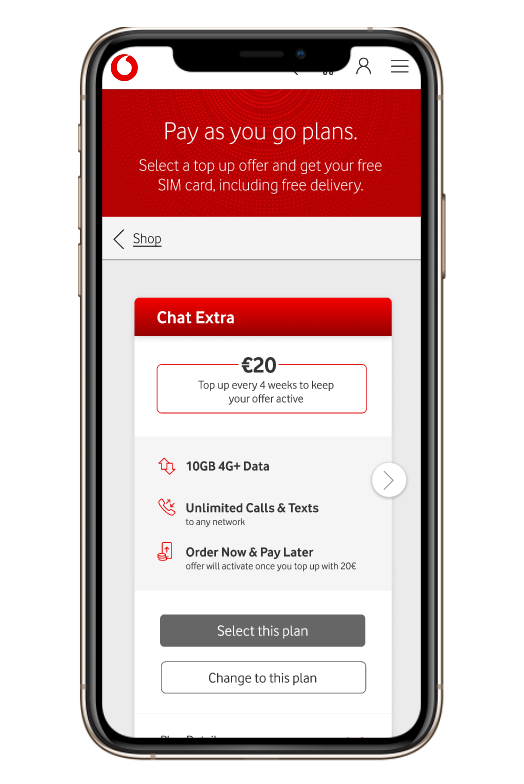
The first element I applied to prototypes A and B, was to eliminate an extra step between viewing the plans and continuing to the basket. Originally, there was only one button below each plan which said ‘choose this plan’. Upon clicking this button users were confronted with an overlay which prompted them to continue as a ‘new customer’ or an ‘existing customer’. In line with UX best practices, I chose to implement this essential step into the actual page instead. New customers could now directly ‘select this plan’ while existing customers could ‘change to this plan’ to continue on their user journey.
For prototype B, I implemented a tool designed to help users quickly find the plan that was right for them. The accordeon table included the three main differences between the plans and pointed the user towards the relevant options.
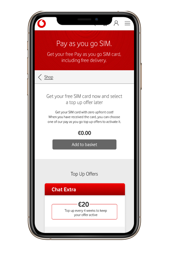
Prototype C drastically differed from prototype A and B in that it skipped the plan selection process entirely. Users were simply prompted to add a SIM card to their basket and choose a plan later. The aim was to remove complexity entirely, with the hope of getting the users to the basket much quicker.
Once I had designed and created the clickable prototypes in Figma, I drafted a user testing proposal and outline which I presented to the various stakeholders from across the other professional teams. My main research questions were:
Do new customers and existing customers know which of the two plan selection button applies to them?
Does the accordeon table help the users to find the right plan for themselves?
Do users understand the connection between the SIM card and the plans?
We eventually carried out the user test with 6 users, 4 of which were not currently Vodafone customers. We used the remote user testing software Loop11, and each test was carried out by one of our designers and observed by another one. I personally carried out three of the tests and observed the other three.
After the user tests, I lead a debrief session with everyone involved in the testing process. Together we summarized and discussed all our insights from the tests and decided on a strategy going forward.
I then prepared a presentation which I sent to all stakeholders from across the unit explaining the outcomes of the test and our further plans. Based on the results, we had decided to eliminate prototype C, as it defeated its purpose entirely by triggering more confusion rather than eliminating it.
Prototype A and B had performed much better with promising results from both the two new buttons, as well as the accordeon table. Therefore, our final step in validating the new design was the implementation of an A/B test on the live website.
The original design was supposed to go up against the new design, in order to measure the true impact of the user experience improvements.
However, at this point my internship came to an end and I had to hand off the project to the other designers on my team.
My favourite part of this internship was the autonomy and responsibility I was given from day one, as well as being welcomed and valued by my team as one of their own. I also tremendously benefitted from the guidance of my manager (the lead designer) and his unwavering trust in my capabilities. He enabled me to truly thrive and evolve immensely as a designer in this short period of time.


